
How to Decorate a Wall with National Park Posters The Complete Guide to Sizes, Composition, and Color
Want to turn a blank wall into an inspiring travel map using posters? This guide covers everything: the right sizes (60–75% of the wall zone width), effective compositions, color temperature, and proven tips that will make your interior feel alive and uplifting. These recommendations work not only for national park posters but for any travel posters as well.
National park posters are so much more than just pictures on the wall. They are your personal memories of the wind in a canyon, the scent of pine trees, and those breathtaking moments when nature takes your breath away. When chosen and arranged correctly, minimalist travel posters transform an ordinary room into a space where you feel a daily boost of energy and calm at the same time.
When size, composition, and color work together, you literally travel back to those special places without leaving home. But if something is off, even the most stunning view of Yellowstone or the Grand Canyon can fall flat and evoke no emotion at all.
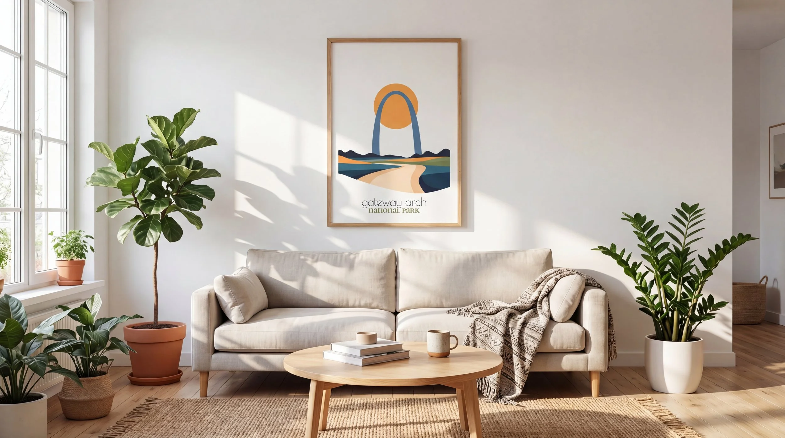
Gateway Arch Minimalist National Park Poster by Retravell
How to Choose the Right Size for National Park Posters
The most common mistake is picking a poster based on how nice it looks on screen instead of how it fits your actual wall.
The right approach is simple: the composition should occupy 60–75% of the width of the area above which it hangs. This works because it creates visual balance — the wall doesn’t feel empty, yet it doesn’t feel overcrowded either.
Examples you’ll actually feel in your space
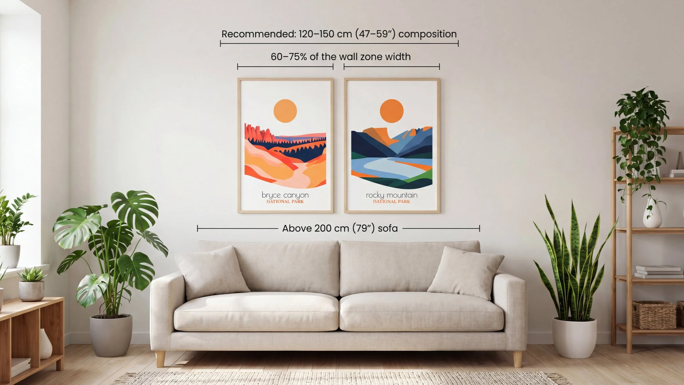
Above a 200 cm 79" sofa a 120–150 cm 47–59" composition looks harmonious and cozy.
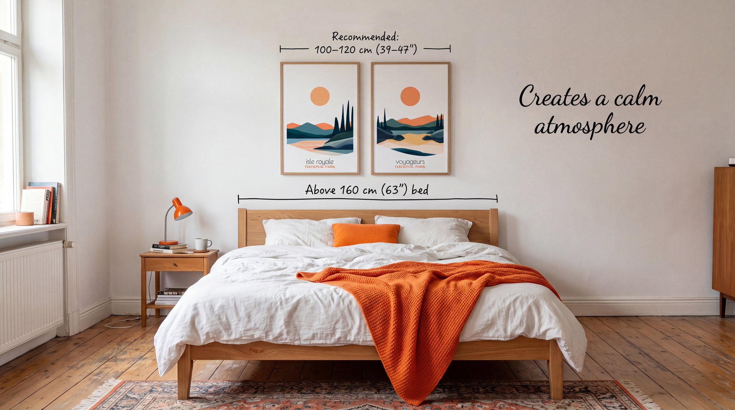
Above a 160 cm 63" bed go for 100–120 cm 39–47" — the room instantly feels calmer.
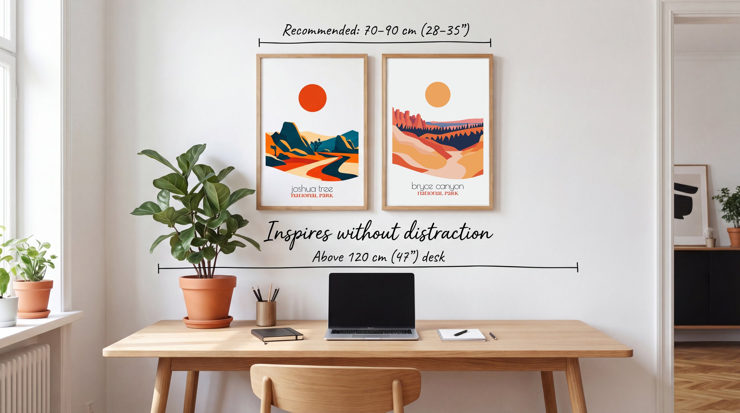
Above a 120 cm 47" desk70–90 cm 28–35" is enough to inspire without distracting.
Above a 200 cm 79" sofa a 120–150 cm 47–59" composition looks harmonious and cozy.
Bryce Canyon & Rocky Mountain Minimalist National Park Posters by Retravell.
Above a 160 cm 63" bed go for 100–120 cm 39–47" — the room instantly feels calmer.
Isle Royale & Voyageurs Minimalist National Park Posters by Retravell.
Above a 120 cm 47" desk70–90 cm 28–35" is enough to inspire without distracting.
Joshua Tree & Bryce Canyon Minimalist National Park Posters by Retravell.
Which formats to choose
Small formats 8×10″ or 12×16″ Perfect for building series and adding small accents. They bring rhythm to a gallery, but rarely work well on their own.
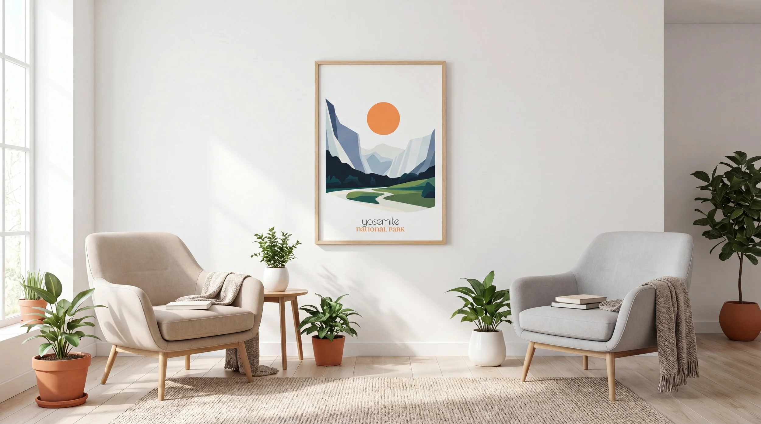
Medium formats 18×24″ The most versatile and comfortable size. You’ll feel how such a poster calmly “holds” the space in a bedroom, home office, or small living room. It beautifully showcases one strong landscape without overwhelming the room.
Large formats 24×36″ and bigger This is where the real wow effect happens. The larger the format, the stronger you feel the scale of nature. Place them above a sofa or on empty walls — and every time you walk by, you’ll instinctively pause and dive back into the memory.
Important note: A small poster with a grand view (like Yellowstone or the Grand Canyon) loses all its power. For travel themes, a large format almost always wins because it truly conveys the feeling of being there.
How to Build a Composition with National Park Posters
Travel posters shine especially brightly in series — they turn into your personal visual story of adventures. One image is a memory. Several together become a full story.
Three approaches that always deliver great results
One powerful focal point — a single large poster as the centerpiece of the room.
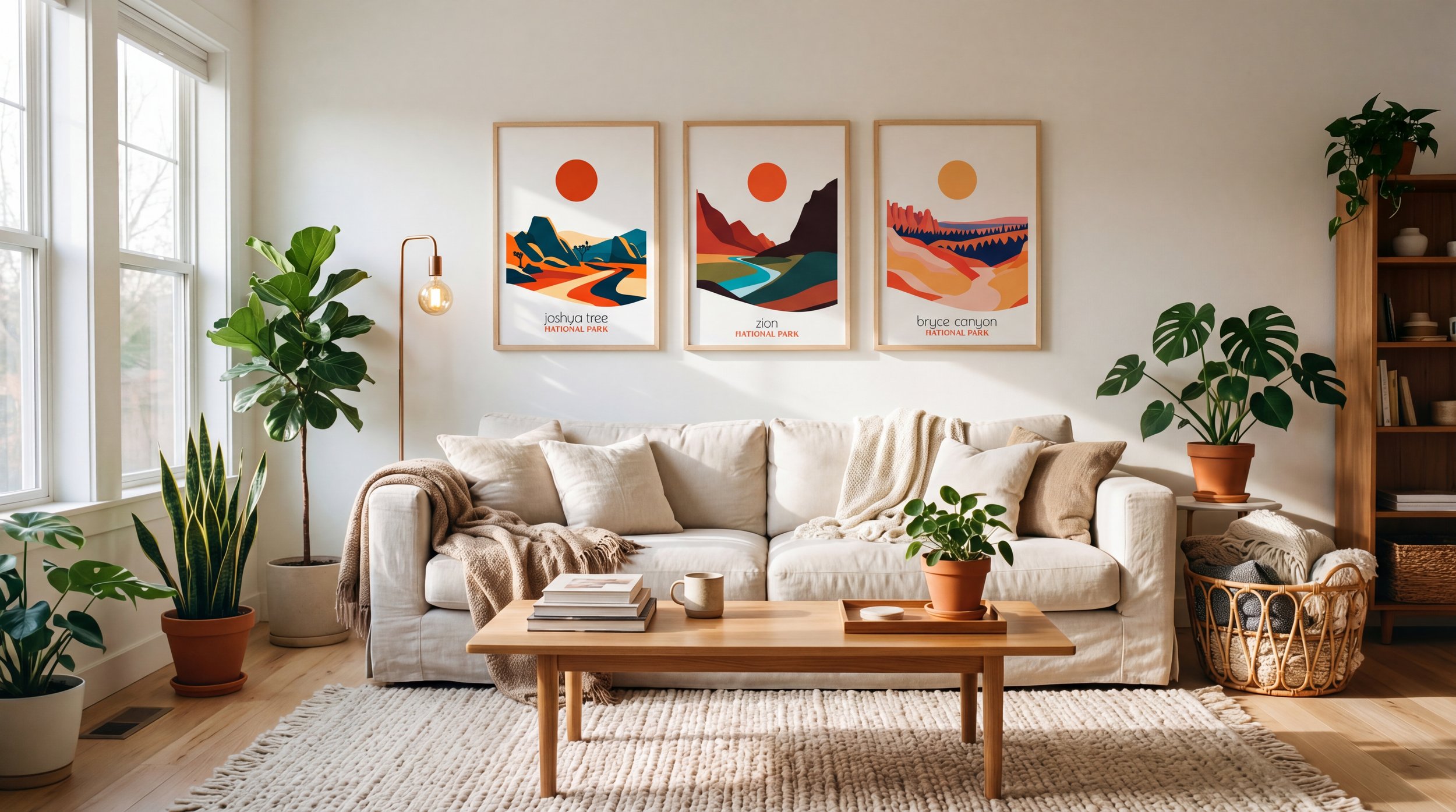
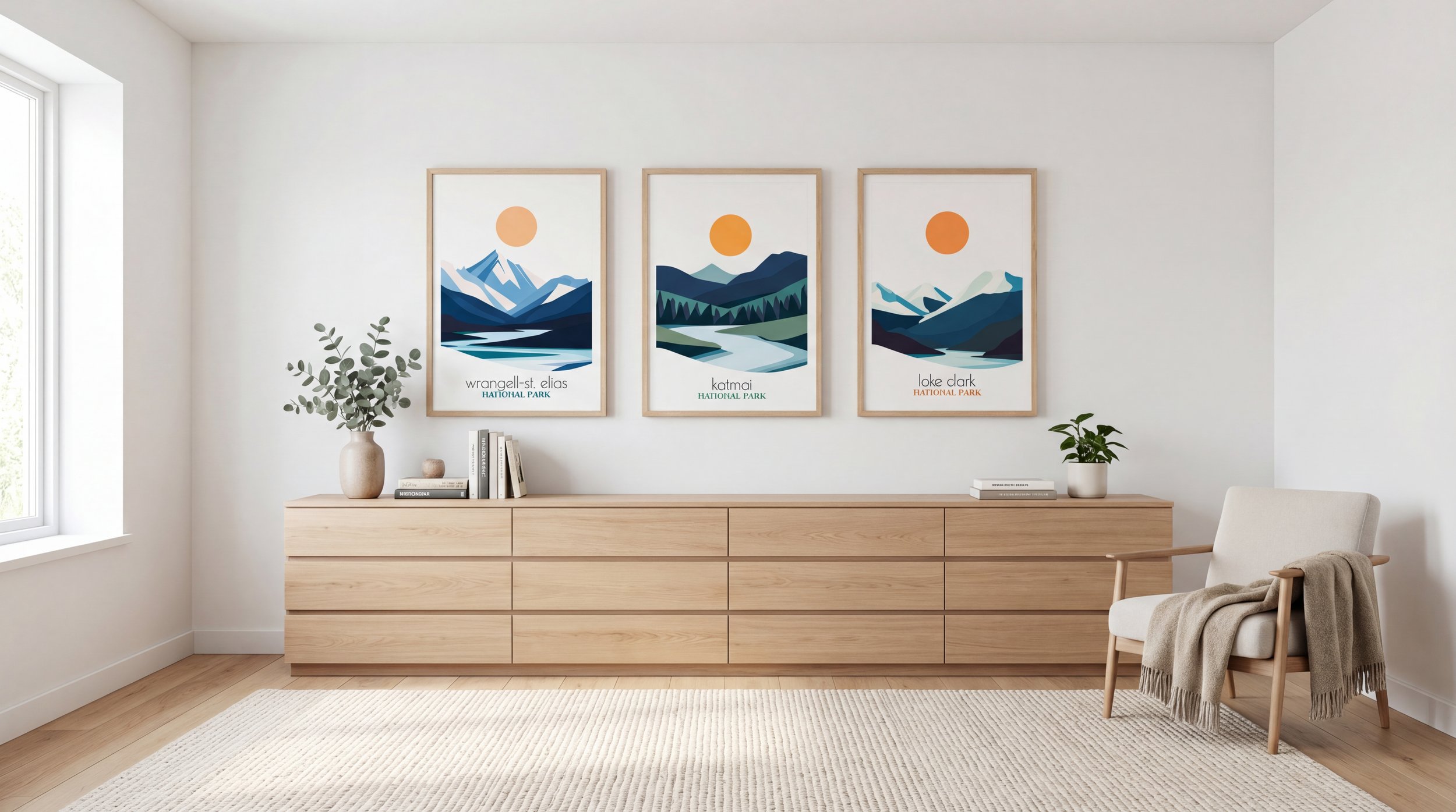
A series of 2–3 posters in the same size and style — clean, calm, and very harmonious.
A travel gallery 3–6 posters featuring different national parks in a unified minimalist style. The result is a true “map of adventures” that reminds you of life’s bright moments every single day.
One powerful focal point — a single large poster as the centerpiece of the room.
Yosemite Minimalist National Park Poster by Retravell.
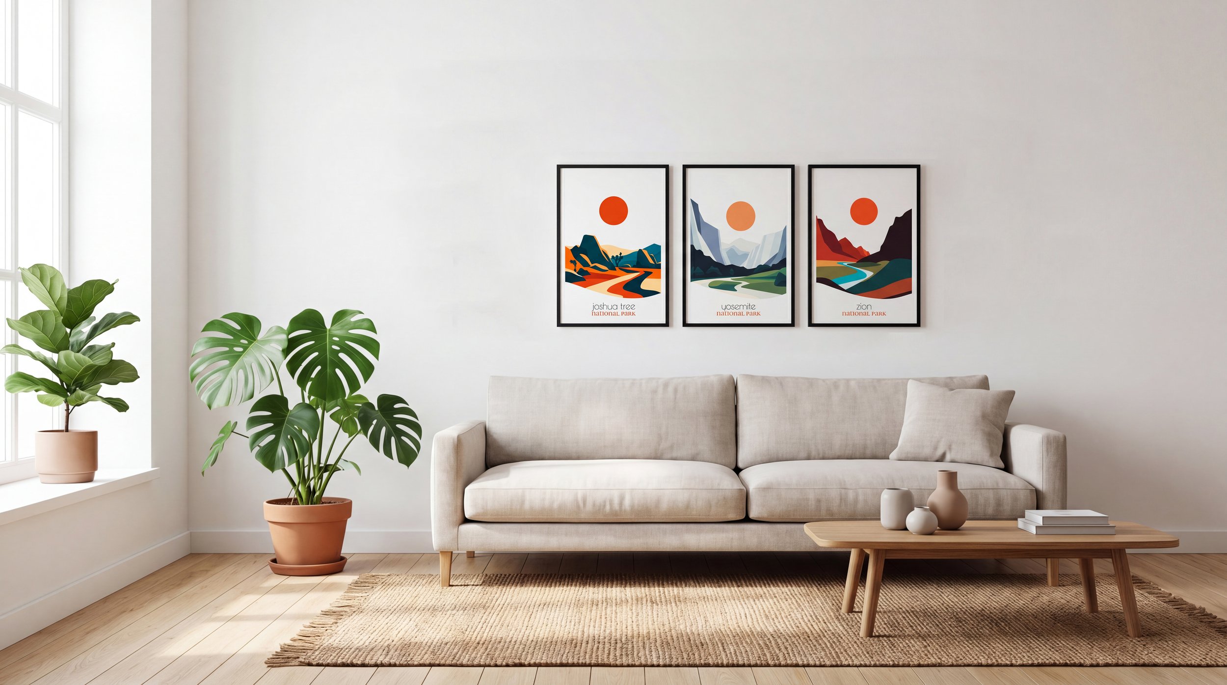
A series of 2–3 posters in the same size and style — clean, calm, and very harmonious.
Joshua Tree, Yosemite, Zion National Park Posters By Retravell.
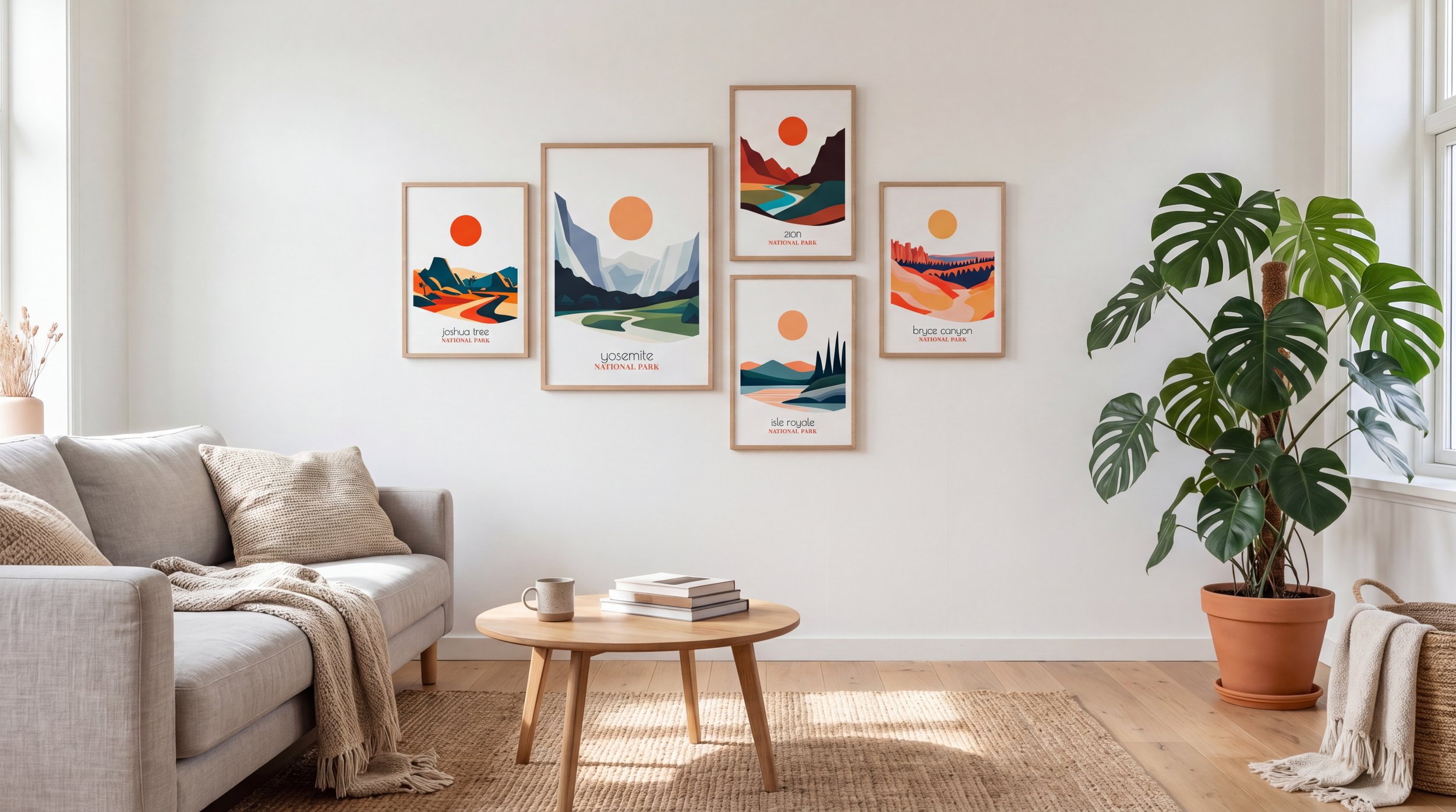
A travel gallery 3–6 posters featuring different national parks in a unified minimalist style. The result is a true “map of adventures” that reminds you of life’s bright moments every single day.
How to Properly Assemble a National Park Poster Gallery
To make your composition look professional and avoid chaos, follow these rules. They work because the human eye loves order and rhythm.
Grid layout with identical sizes — the safest and most peaceful option.
Central focal point: one large poster 24×36″ + 2–4 medium + 1–2 small. This approach adds depth and natural hierarchy.
Freeform composition with mixed sizes — looks light and modern, but requires careful testing on the floor before hanging.
Spacing that affects perception
Between posters:3–5 cm 1.2–2 inches — this creates “breathing room” and prevents elements from blending together.
From the edges of the composition to furniture or corners:8–12 cm 3–5 inches.
Alignment: Choose one system for the entire gallery — top edge, center, or vertical axis. Even a slightly “chaotic” gallery is actually built on clear logic.
Hanging height
Center of the whole composition:145–155 cm 57–61 inches from the floor (roughly eye level).
Above a sofa or bed:15–25 cm 6–10 inches from the top edge of the furniture.
Size balance is critical: you always need one large “anchor” poster. Without it, the gallery visually falls apart and loses impact.
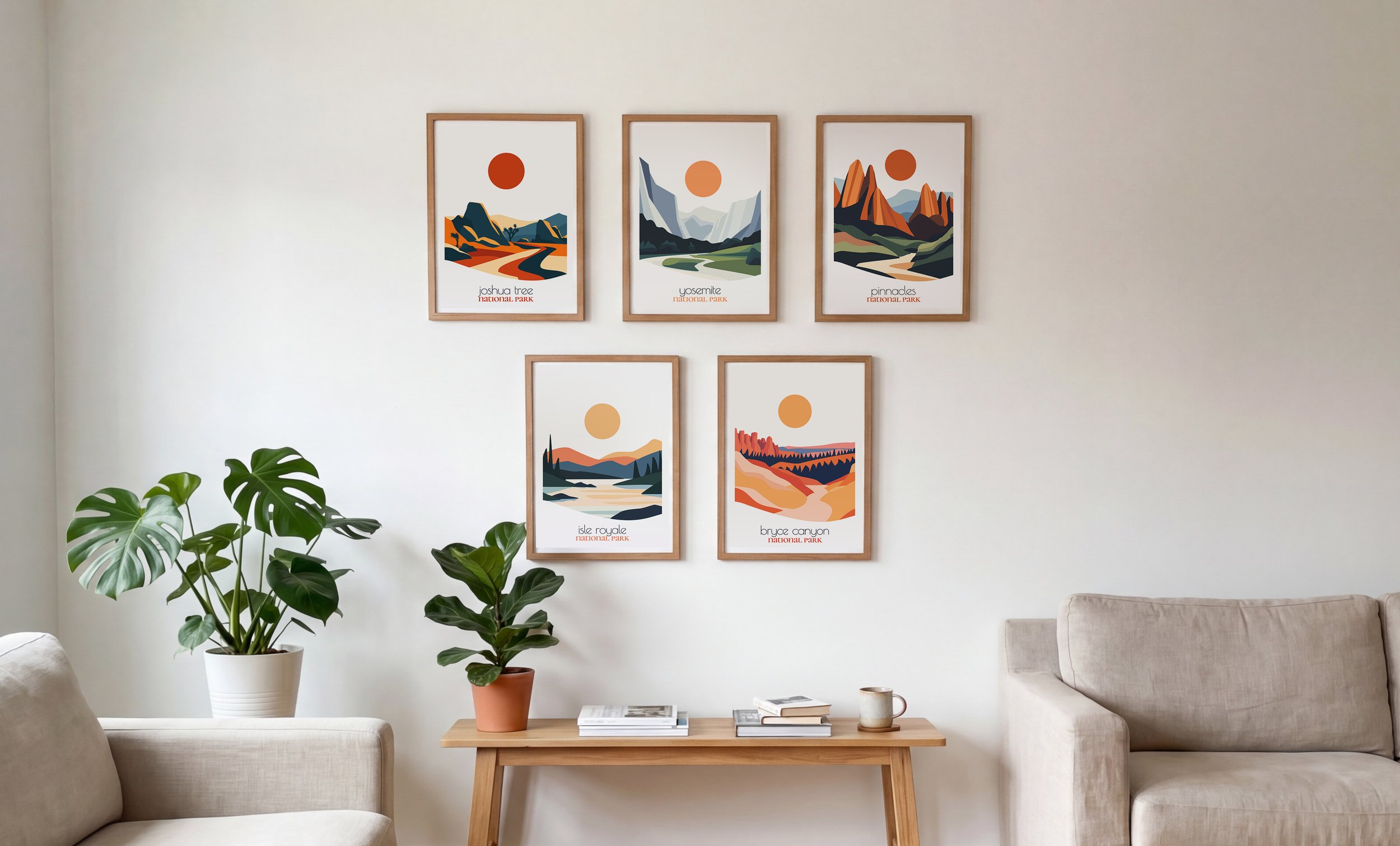
Grid layout with identical sizes — the safest and most peaceful option.
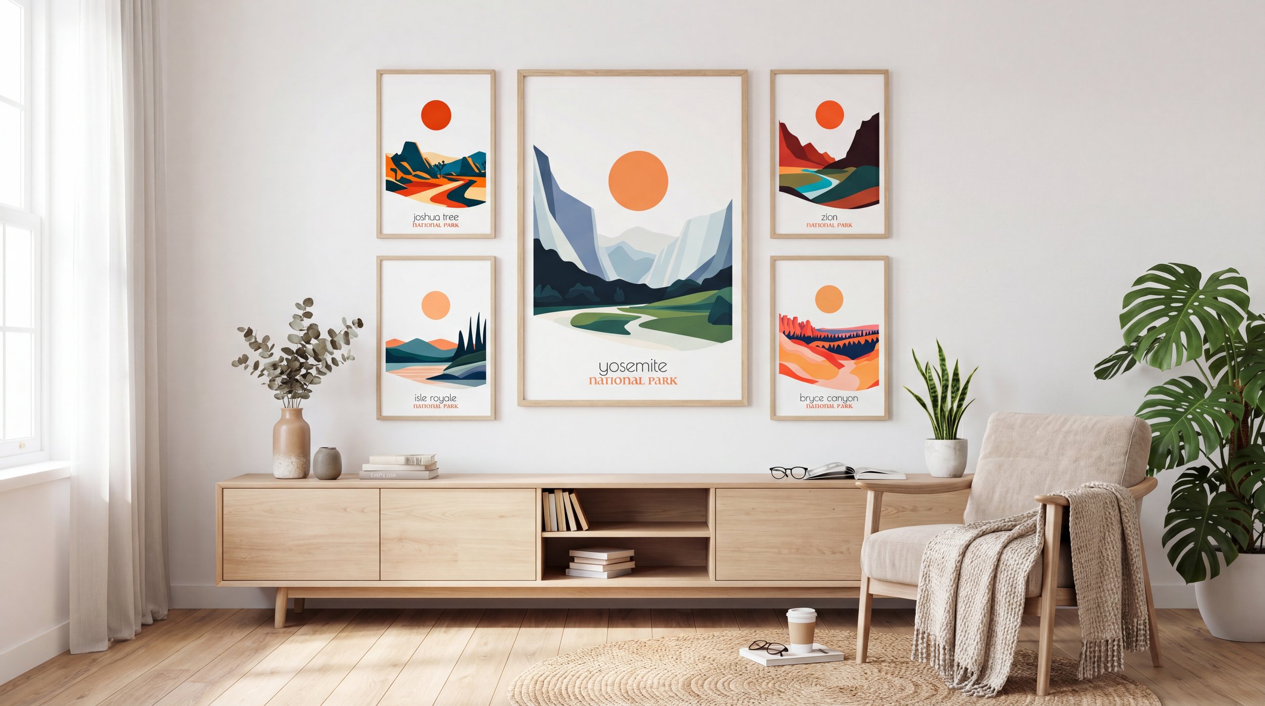
Central focal point: one large poster 24×36″ + 2–4 medium. This approach adds depth and natural hierarchy.
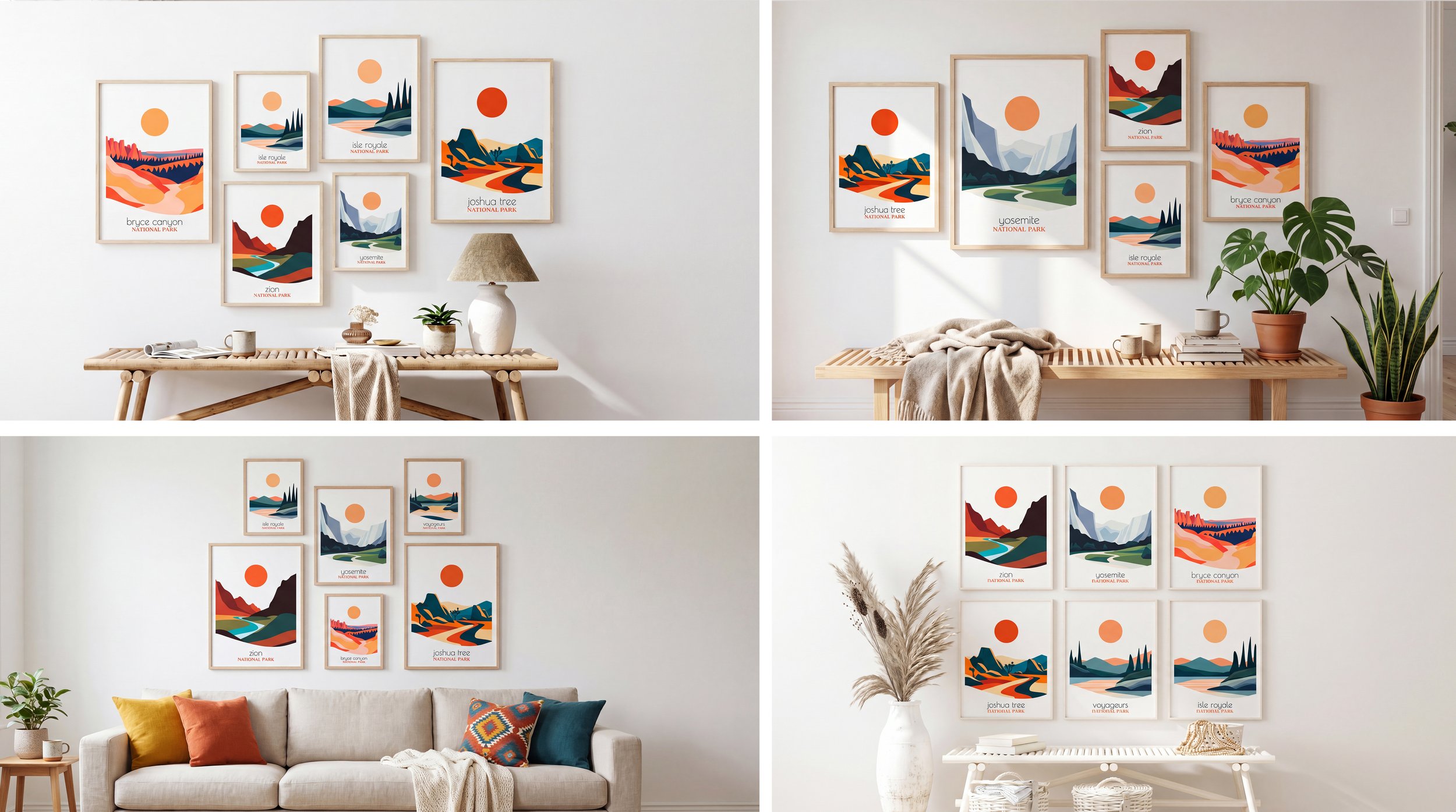
Freeform composition with mixed sizes — looks light and modern, but requires careful testing on the floor before hanging.
Color and Temperature How They Affect Your Emotions
Color in travel posters isn’t just about beauty — it’s a powerful tool for setting the mood of the room.
Warm tones rusty canyons, golden sunsets, desert landscapes add coziness and softness. You’ll feel how the room becomes warmer and more relaxing.
Cool tones green forests, snowy mountains, turquoise lakes bring freshness, depth, and a sense of purity. They work especially well in workspaces where you need focus and clarity.
Three strategies that deliver excellent results
Single color temperature — the calmest and safest choice.
Gentle mixing within a clear structure.
One contrasting accent that draws the eye.
The key is having an internal logic. Then the wall will delight you for years instead of tiring you out.
Single color temperature — the calmest and safest choice.
Gentle mixing within a clear structure.
One contrasting accent that draws the eye.
How to Decorate a Wall with National Park Posters Step‑by‑Step Plan
Identify the zone and measure its width.
Calculate 60–75% of that width — this is your target.
Choose formats and number of posters.
Decide on the composition structure.
Select the color temperature to match the room’s desired mood.
Leave enough breathing space around the arrangement — this makes the space feel more expensive and serene.
Quick checklist before buying
Composition fills 60–75% of the zone
There is a clear visual center
All spacing is consistent
Alignment is consistent
No sense of visual chaos
Author
Valerii Kuchin — Founder and Creative Director at ReTravell Studio. Education in easel painting and a second degree in graphic design. 8 years in fine arts and design. Creator of 10+ travel poster collections, designer of print graphics for apparel and merchandise. Valerii leads product design and art direction for ReTravell and personally curates each national park series.
FAQ
What size poster should I choose above a sofa? Choose a composition that fills 60–75% of the sofa width; for a 200 cm sofa pick 120–150 cm.
How high should I hang a poster? Center of the composition at 145–155 cm from the floor; above furniture leave 15–25 cm.
How much space between posters? Keep 3–5 cm between frames for breathing room.
Is a small poster OK for Grand Canyon views? For grand landscapes choose larger formats (24×36″+) to preserve scale and impact.