
How to Create a Travel-Themed Home Without Overdecorating
At Retravell, we see travel posters not as decoration, but as visual memories — quiet reminders of places that changed the way we see the world.
That’s why a travel-themed home should feel intentional, calm, and personal — not overloaded with symbols or obvious references.
The goal isn’t to show everywhere you’ve been, but to reflect how travel lives in you.
This guide explains how to build a travel-inspired interior using posters and prints — without overdecorating your space.
Overdecorating rarely happens on purpose.
It usually appears when visual elements compete instead of supporting each other.
In travel-inspired spaces, this often means:
too many destinations in one room
posters with unrelated styles or moods
decor that explains instead of evokes
A strong interior doesn’t shout “travel.”
It lets the feeling of travel quietly exist in the background.
Why Travel-Themed Interiors Often Feel Overdone
Before selecting artwork, pause and ask:
What kind of atmosphere should this room have?
Common intentions we see from Retravell clients:
calm and grounded
warm and nostalgic
open and expansive
minimal and contemplative
Once the mood is clear, choosing the right travel poster becomes easier — and overdecorating becomes unlikely.
Define the Mood Before Choosing the Poster
Restraint is one of the most powerful design tools.
Instead of filling multiple walls:
choose one strong poster
give it enough space
let it become a focal point
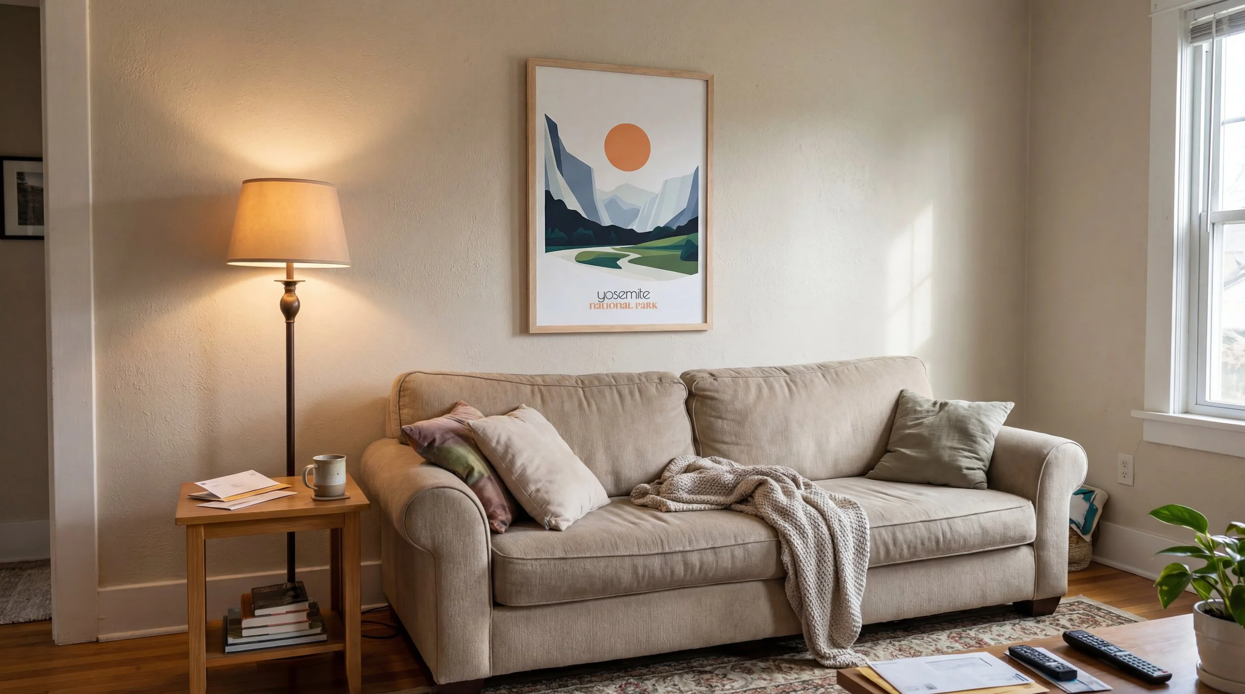
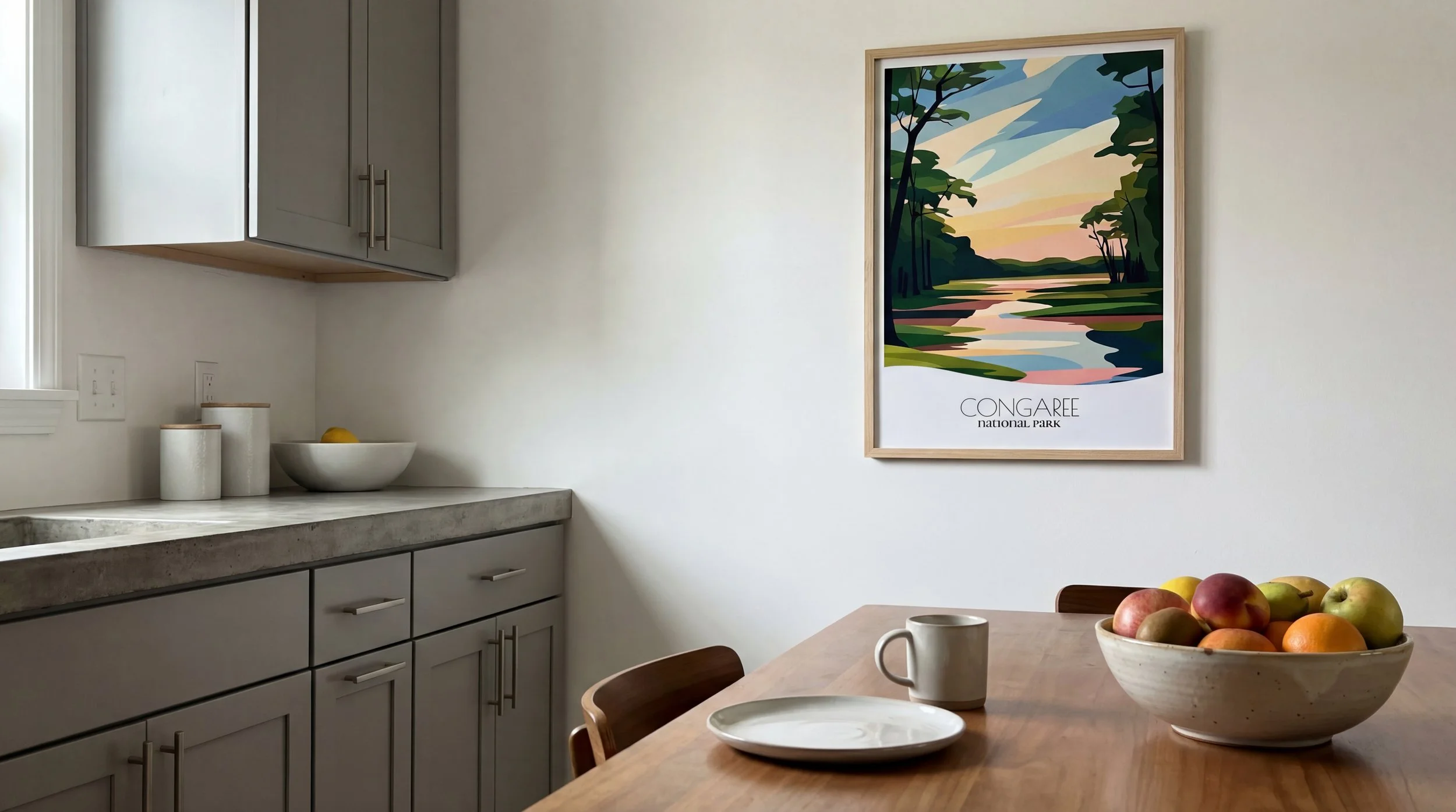
A single travel poster with the right scale and presence can define an entire room more effectively than a crowded gallery wall.
This approach works especially well with - Abstract & Minimalist Design National Park Travel Posters.
One Statement Poster Often Works Better Than Many
Travel decor doesn’t need to be literal.
A landscape, a color palette, or a simplified form can express travel more elegantly than maps, quotes, or obvious symbols.
That’s why Retravell focuses on illustrated national park posters — they don’t explain the place, they capture its feeling.
Explore the philosophy behind this approach in our - Bold & Abstract National Park Posters
Let the Artwork Suggest the Journey
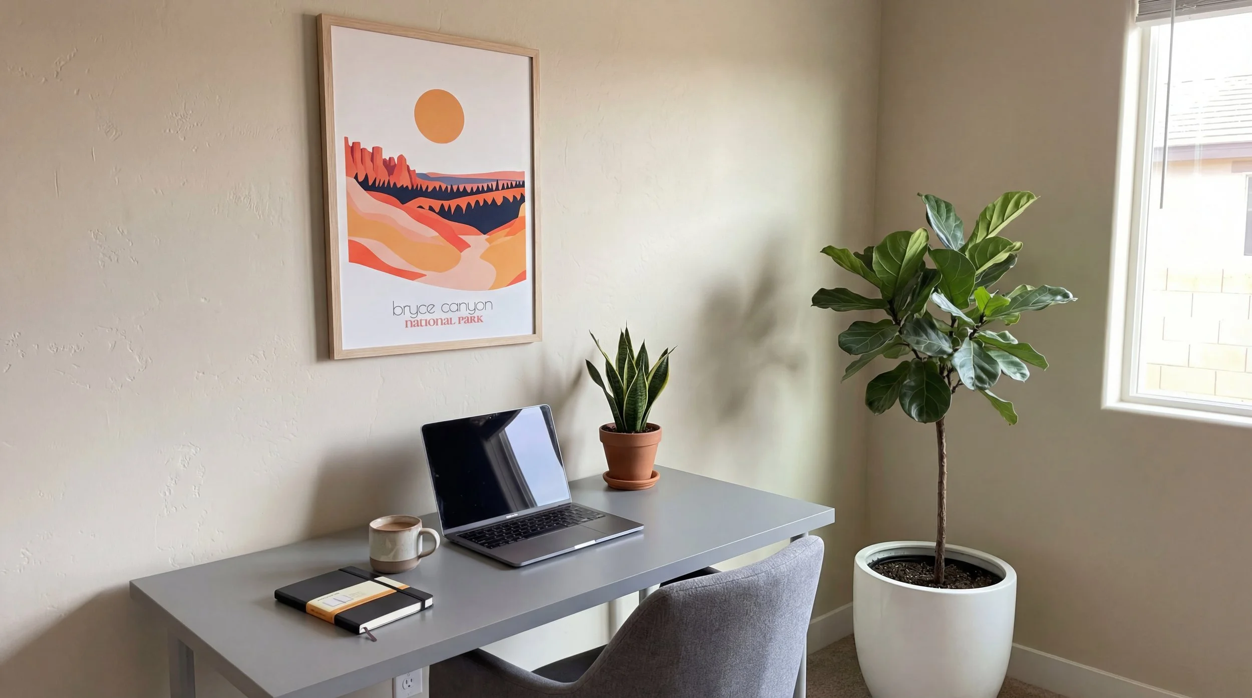
One of the most overlooked aspects of styling travel posters is interior temperature — warm vs cool spaces.
Warm Interiors (wood, beige, terracotta, soft light)
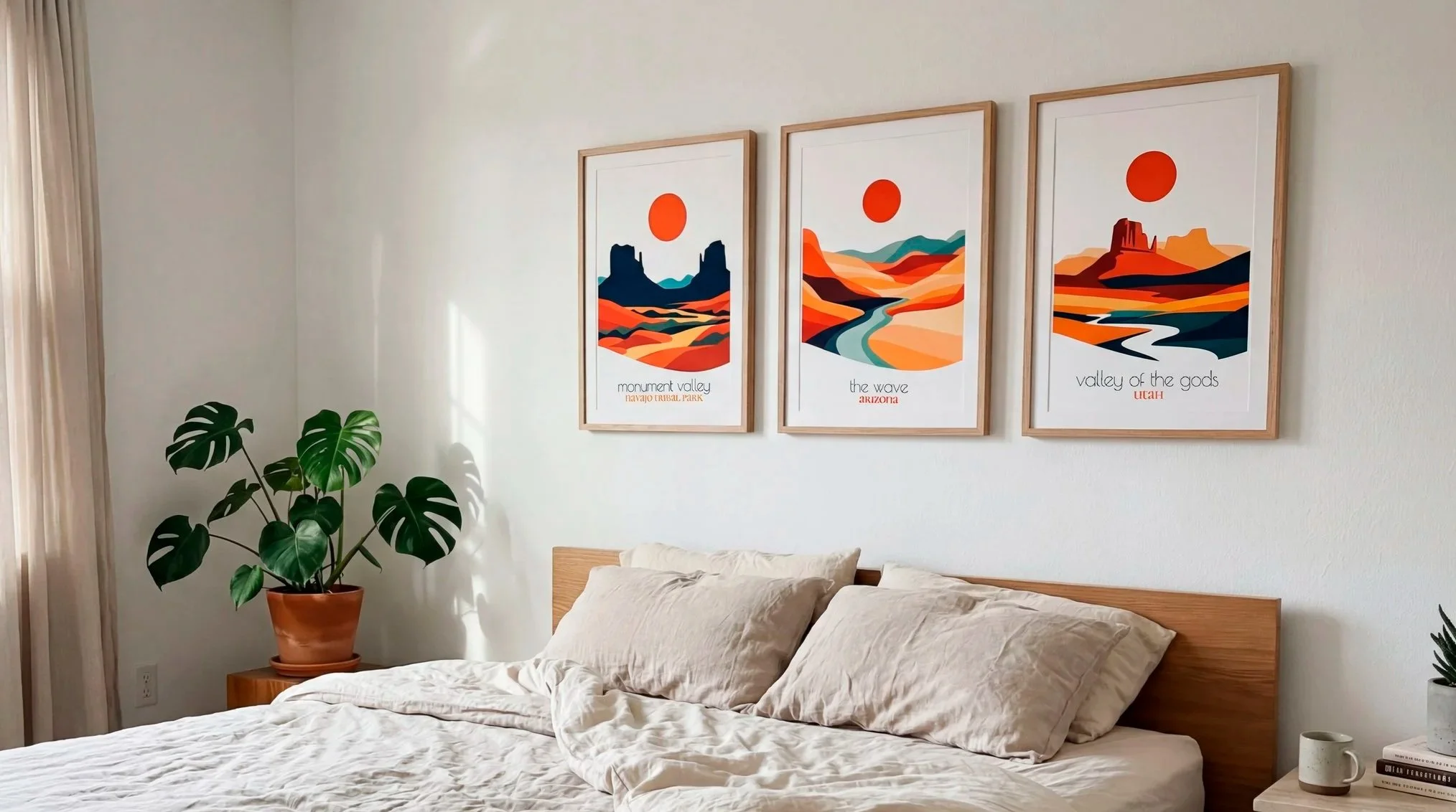
For warm interiors, posters with earthy tones and desert landscapes feel natural and balanced:
Sedona, Arizona
Monument Valley
Valley of the Gods
These prints enhance warmth without overwhelming the space.
See selected warm-tone posters:
Match Poster Mood to Interior Temperature
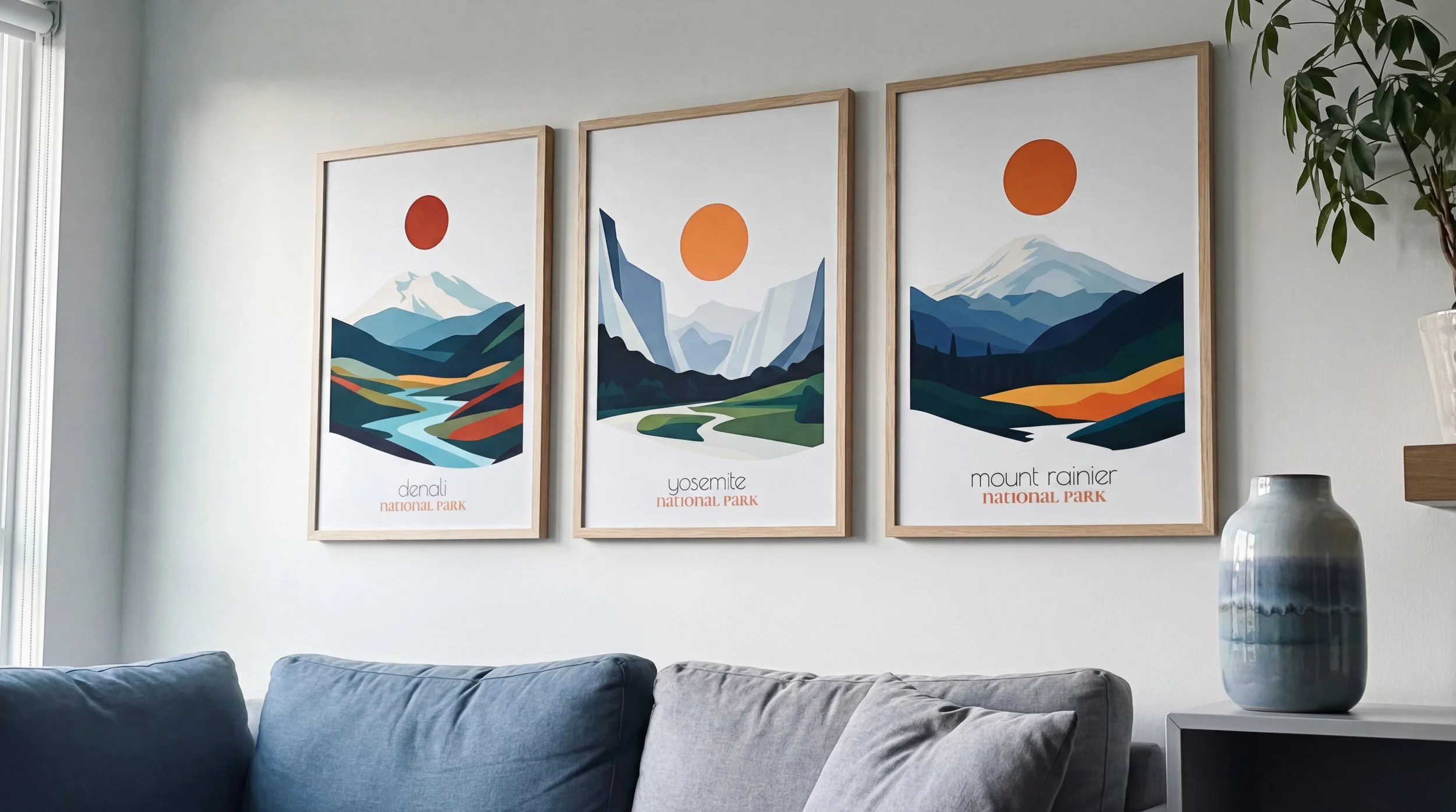
In cooler interiors, clarity and openness work best. Northern landscapes and alpine parks feel calm and expansive:
Denali National Park
Mount Rainier National Park
These posters reinforce a sense of space and quiet strength.
See selected cool-tone posters:
Cool Interiors (gray, concrete, white, natural light)
To avoid visual noise, it’s important not to mix too many visual languages.
At Retravell, posters usually fall into two directions:
Minimalist collections — calm, restrained, architectural
Bold collections — richer colors, stronger contrast, emotional impact
Both work beautifully — but mixing them without intention can create imbalance.
Explore:
Minimal vs Bold: Choose One Direction
A travel-themed home doesn’t need to be themed everywhere.
Travel posters are most effective when they:
anchor a neutral space
act as a visual pause
feel personal, not decorative
When treated as accents, they age better and feel timeless.
Travel Posters Work Best as Accents
When you decorate with intention, your home doesn’t tell people where you’ve been.
It shows how travel shaped your perspective.
That’s the difference between decoration and meaning — and the reason travel posters can feel deeply personal when used thoughtfully.
A More Personal Way to Decorate With Travel
Final Thought
A refined travel-themed home is built on confidence, not quantity.
Choose fewer posters.
Give them space.
Let them speak quietly.
That’s how travel becomes part of your home — without overdecorating it.